So this will be the last post of this series unless I decide to do this again next semester. I really don't know the format of next semesters studio though so I don't know if I will be able to post a blog.
Now that you've seen the SketchUp drawings, you'll recognize my final drawings. I traced over the SketchUp drawings I printed out and added color and whatnot. Here's my process with a variety of different drawings because for some reason I didn't do a complete process with one drawing:
Again, I traced over the entire picture using special types of ink pens. They come in a pack of six and vary in size so the thicker the line, the more important or prominent the building or whatnot. I again attempted to use a straight edge for the drawing but if you look really closely, only a few lines are actually parallel to the straight edge.
After I inked the entire image I added color. Here's the beginning of a perspective with the trees half way colored. I love coloring trees for some reason haha.
Here is the finished perspective. Unlike my previous project I did not completely color the sidewalk or road so it wouldn't be overpowering.
Just for comparison, this is a finished elevation above the printed sketchup drawing.
And here is my desk where all this work took place. I would ask someone to guess what movie I was watching but the box is right next to the computer =/
All of this lead to a 24x36 inch board. Instead of posting each individual drawing I'll just post the whole board. If you click on the picture it should get pretty large so you can see the individual drawings.
I'm pretty proud of this bad boy. I think when compared to my previous project I've really improved. Actually, this is the first final board I can look at and feel proud of my work. I think using SketchUp and understanding how to work the program really helped too. These drawings look so different than last years when we couldn't use computers at all (or we weren't suppose to).
Anyway, I want to thank you guys for reading this blogs, the feedback really helps. And it's nice for people outside of urban planning and architecture look at my work since in reality, I would show this to the community rather than fellow planners. If I can I'll continue this next semester-- I think it's more computer oriented than drawings though, I don't know.
And look for a post in the possible near-future. I'm thinking about posting my NaNoWriMo story online so I'll give you guys a link if you want to read it too.
Thanks again!
Thursday, May 20, 2010
Monday, May 10, 2010
Road to the Final: Sketchup
Alright guys, the final project is now officially finished. There's only going to be two more posts, this one and then the final design/drawing one.
Once I had my final idea on paper, I went to work on the computer. I used a program called Sketchup by Google. It's pretty good for a free program. I like to compare it to the MS Paint version of Photoshop. It does the job but it doesn't come close to AutoCad...actually that may be a little harsh comparison. Sketchup can actually do quite a lot for being a free program but AutoCad just takes it to the next level. Plus, AutoCad looks confusing (in the few cases I've watched my friend use it) and Sketchup is pretty user-friendly and does the job nicely :)
Basically, I can create models in sketchup. Houses, trees, sidewalks, buildings...basically anything. And another cool feature is the 3D Warehouse. I didn't create any of the trees, cars, people, basketball courts, etc because others already did. I simply downloaded the models onto my model. It's a huge time saver. I can also figure out the square footage of a building which was extremely helpful as well since we had a minimum requirement for the square footage of retail, office, etc.
So I created my final design in sketchup. First I just created boxes, but as I figured out what I was going to draw, I added details to those shots. Every picture I will show have added details. Trust me, the majority of the buildings are blank, simple boxes.
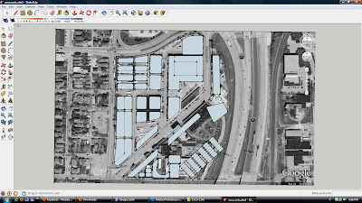
It took me about a week from the beginning to end of my 'sketchup phase.' Sketchup has this useful feature that allows a photo from Google Earth to be imported, so that's how I got the building and lot size. I didn't have to do any measuring :) Here is what my design looked like about halfway with the Google Earth background. I managed to delete the background somewhere along the way and didn't know how to get it back so there isn't a picture with the final design and Google Earth.
It took me a while to figure out a final design, mostly because of the parking. There was a minimum requirement of parking for x amount of retail and x amount of units. So, I had to balance between figuring out the number of parking with the amount of retail/office/residential. This took me about three days =p. Then I went to work with the details for my final drawings. These are the final pictures/screen shots from sketchup:
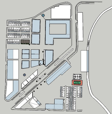
This is the site plan, sorry it's lopsided. One of the hard, or annoying, parts of this project was no two buildings were exactly parallel or perpendicular to each other because the buildings I kept from the current site weren't. Fun tidbit =P
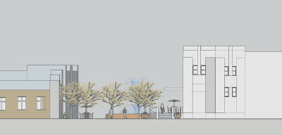
This is my first elevation. It shows a pedestrian corridor with shops and restaurants between two buildings.
This is a section cut (section cuts go through buildings, elevations don't. Sadly, I forgot that fact on my final board and named them all section cuts =p). It shows a theater with seating and some of the store fronts in the background.
This is an elevation of townhouses, next to a retail building (right). Yep, that's about it.
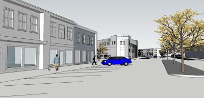
This is a perspective that shows my streetscape. As I said before, the people, trees, and cars were not created by me. Everything else was though.
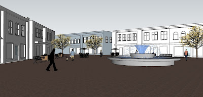
This is another perspective that I actually didn't use in my final board because there wasn't a need for it. It shows a plaza and fountain in a retail, mixed-use, shopping area.
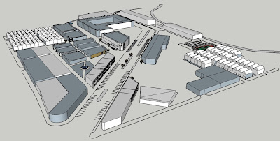
This is technically another perspective. Usually when showing an entire site, you use an axonometric or isometric to show elevation. On sketchup, it's slightly difficult to get the view you want and still have it be an axon or iso so I kind of just picked a view and went with it. It gives the same idea as an axon or iso.
And that is it. Those are the images and views I made with sketchup. I then printed these out and used them as a template for my drawings. The next post will show this and my final board :)
Thanks for reading!
Sunday, April 18, 2010
Site Pictures
Here are just a few pictures that I took of the site. I took over 200 photos but I decided to condense it down for you guys haha
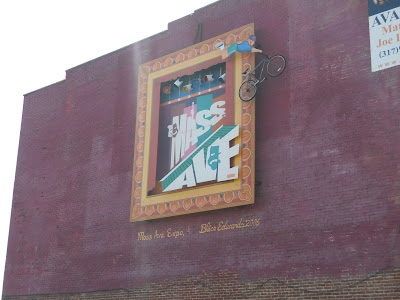
This is what is facing the freeway and is the symbol of Mass Ave.
A small row of shops along Mass Ave. This is the type of shops that I want to put into my design.
Part of the Coca-Cola Plant. Again, this is on Mass Ave.
This is the area in between the buildings looking north.
The whole site has a design like this. Yeah, I can see why we can't/shouldn't mess with the facade.
This is what it looks like in the interior (the corridor). We went down half way before we got kicked out haha.
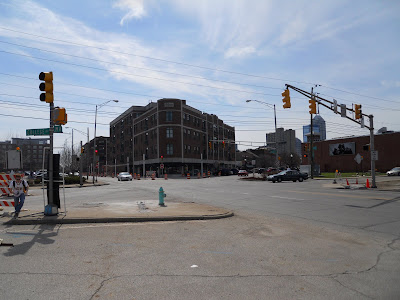
The 6-way intersection.
Picture of the industrial part. It basically all looks like this: cars, random buildings.
And that's it. Most of the pictures I took is of the surrounding area (neighborhoods) that are located off-site. I felt these are the most important ones for you guys.
And in case you haven't noticed, there's another new post under this one (I think under...) Check it out!
Thanks for reading :)
Beginning of the End
Hey I actually fulfilled my promise!
Okay, here's my three alternatives for the design of the site. Just like my first post with pictures, this is the process to reach the final drawing.
First, here's the site:
This is what is currently there. The white rectangles to the north west are buses. The northern portion of the site is currently used to house businesses and the transportation offices and such for the Indianapolis Public Schools. We're pretending they're not there. The southern half is a mix of industry and businesses.
First, I already had a ton of different rough alternatives (maybe around 6, 7?) but we only needed three to tada! These were meant to show to my professors for feedback, hence the reason why there's scribble on them.
Just for reference for all of my drawings:
Yellow: Residential
Red: Retail
Pinkish: Business
Green: Grass/Open Space
Grey: Parking
Blue: Special Use (For this purpose a recreational center and outdoor theater)
If you see a building or area with two different colors, it's mixed use, containing both uses usually divided by floors.
Now for my final, clean version of those:
First, I made an underlay for the alternatives on top of the Google Earth image. Without a light table (a glass/see through plastic table with a light underneath that lets you see through paper better), it is hard to see where the buildings and roads were. So, I had to take some time and outline the roads and buildings I knew were there and was considering keeping on my final.
As you can see, I didn't keep a lot of buildings haha. But, there's a good reason for that. The industrial buildings to the south weren't made for public use and I couldn't see an obvious way to incorporate the buildings into a functional design (at least with the time given to me). They're currently large warehouses and huge parking lots. The buildings I did keep have been highly recommended to keep by my professors. They were the site of an old Coca-Cola Bottling Plant so the facade is really cool (I'll post pictures of it in the next post) and the owner of the building can get tax deductions and whatnot. It's not the law to keep the building and the facade but is "highly recommended."
On with the design....
I'm only going to show the process of one of the alternatives since they are basically all the same, just drawn differently. I placed another trace paper on top of the drawing shown previously and outlined the buildings and roads that I absolutely knew the size of. The spaces I was unsure or still deciding I first drew in pencil.
I then inked and showed a rough size of my proposed buildings and spaces. The dotted lines are areas that would be nodes, or hot spots for pedestrians to meet or gather.
I then colored the spaces based on their uses and outlined the buildings and areas (the double line). I still think it's really weird how different it looks by just added a double line...
I then shaded the areas with colored pencil. And voila! the final product.
Here are the final products of all three. Compare it to the previous picture that showed the concept of these.
Oh, and there's my trashcan too.
Just for a fun side-note, here is what my middle finger looked like after I was done. I have no clue how I got so much ink on my hand...and it took multiple washings and about a day for it to go away =P And there's my workspace in my room. I felt like shit earlier that day and didn't want to work in studio so I had to bring everything to my room. I should have a picture of my studio and my desk later in the blog....
And just FYI, my next drawings will be from a computer program, rather than by hand. I make model on the computer of my design, print it, then trace and add color. So, the next posts will not be the same as what I have been posting....you'll see what I mean when I post it haha.
WHO CAN SPOT THE BUZZ LIGHTYEAR IN THE LAST PICTURE!?!
Thursday, April 15, 2010
Quick Update
Okay guys, I know I haven't updated in over two weeks but there are pretty good reasons
1. Easter weekend, seeing the family and such
2. Our group had another analysis board thing based on the neighborhoods. The group member who put together the board lost her flash drive which contained the only copy of the jpg of the final board so I cannot show it to you guys. Plus, I did demographic stuff on it so there would be no graphics to show from me anyway.
3. I've been working on other homework. I'm trying to finish everything but studio so I can have my full concentration on that. At the moment, I have 2 tests, 1 quiz, and one article to finish. On top of that, I'm in the mid-process of writing 4 papers, all of which I've started writing within the past 10 days or so. I'm getting burnt out with the massive amount of work and it's frustrating when I work on something for hours and have nothing to show for it (no final, finished product).
Blah
But I'm close enough to be able to finish all four papers this weekend, hopefully Saturday. I've just been lazy to actually edit them. Then I just have the quiz and tests which will only consume my life for a day or two.
We're starting our final board and drawings for the studio assignment. I have pictures for my three alternatives (different options for the layout of my final) so I should hopefully be posting those this weekend.
I don't know if I'll be able to update every week until the project is finished. I mean, there's only 2 weeks left on the project...oh God...
If all else fails, I'll post after I turn it in and school is out.
I can't believe I'm done in less than a month =D
Sunday, March 28, 2010
Studio Blog Update
Hey!
So, there really hasn't been anything to post in this past week. We had another group project but drawings weren't really involved. It was more of an analysis and the pictures are there for a guide and there wasn't any process in making them. Here's the final version (I took out of our last names):
It analyzed the various circulation routes around our site and in Indy and we showed ways that we could improve them (IE continuing the sidewalk). I worked on the bottom 2 and another person in the group and I worked on the board layout.
I think our next board is a group project as well so there probably won't be another process update. Once I actually look through my pictures, I'll post some photos from the site (it is a real place after all).
:D
Saturday, March 20, 2010
Week 1
Okay, here's the first post in this series. I kept on forgetting my camera so some of the pictures are small and not that great of quality.
The first part of the project is the site analysis. We were separated into groups of four so I don't have the full board or all of the diagrams, but here are the ones I did.
Once I start the final portion of the project I should have more pictures since they take longer and there are more details.
Enjoy!
My first diagram is a land use map. It's pretty self explanatory, each color represents a land use (for example, blue is special use (schools, libraries, etc), red is mixed use, yellow is residential). First, I traced all of the streets from the site map.
Using the streets as a guide, I started coloring.
This is what the final product looks like. I then scanned the two images (roads and color) onto my computer. It's messy, I know--that's where Photoshop comes into play.
This is the real final after Photoshop editing. I inverted the roads and cleaned up the color.
I realized I don't have a process of my circulation diagrams =p It's not as noticeable as the land use anyway. I basically outlined the roads--the thicker the line, the busier the road.
This is a circulation diagram too--but shows the sidewalks (red) and the Indianapolis Cultural Trail (green).
Here's the final Photoshop products.
This is my final diagram and I actually did a pretty good job showing the process :D
This one combines adjacent influences, landmarks, and nodes. Adjacent influences are things that would directly impact the site. Some things I pointed out was downtown, Mass Ave, the highway, and the surrounding residental. Landmarks are self explanatory. I included the Murat, the Monet Trail, and a few others. Nodes are points of interest, or where a lot of activity takes place...it's hard to explain. The ones I showed was the I-70 and I-65 exchange and the 6-way intersection close to the site.
Here's the diagram with color. Every color represents something, similar to the land use map.
Now to add some architect/planner flair to it. Basically, I outlined the outline. I have no clue how it works, but it always seems to look a hundred times better...
Then I added some shading with color pencil. Truthfully, this isn't my favorite diagram, I've drawn better ones =p
Here's the final Photoshop version.
And that was week 1. I think in total that took me around 15 hours....and that was a small project. Jeez, it seems like a long time if I put it that way...but really that was throughout the week so it wasn't that bad.
Any comments on how I presented it? That's what I had in mind, but I don't know what you guys thought. And feel free to ask any questions about the project--what I wrote here and the last post only skims the surface. I'm not sure what the next part of the project is...I haven't really studied the schedule yet...
Thanks for reading!
Monday, March 15, 2010
Urban Planning Studio
Studio takes up a lot of my time. Class meets for 12 hours a week--I'm working the full 12 hours. Add on however much extra time outside of class to finish the project (25, 50 hours a week?) I'm so caught up trying to reach the final project that I rarely look back and see what I've accomplished. My process of reaching the goal is obsolete in my grade. As long as it's on my final board and looks good, it's fine. I could have drawn it all the night before and the professors wouldn't care. But I think it's important. The journey is the reason for the end result--I can't ignore it.
So, I'm going to keep a 'diary' of sorts of the process of this (my last) studio project. You guys are invited to watch :)
I guess some background is in order. In my urban planning studio we are given 'sites' in downtown Indianapolis that we have to improve. There's usually a noticeable problem or opportunity (ie large, unused, open space in prime location).
Our site sizes have grown progressively larger. From approximately 500 x 100 square feet to (now) 1 million square feet. This main portion has an empty Coca Cola Bottling Center and is headquarters for the Indianapolis Public School bus parking lot. We're to pretend the IPS have relocated their buses elsewhere, having full control of the site (it would be 1,000% harder to work around them, fyi).
My professor has given us a set of guidelines and buildings to place in the final plan. Here is the list: live/work loft units, mix of market rate and affordable housing, ground floor retail, public open space, parking solution, public and support services of your choice (ie community center, health center, senior center...a draw to the space). More details on the requirements in another blog (if I remember).
We have now until the end of the school year to finish the project. We're in the first phase of the project. In team of four, we have to have an analysis of the site (about a 2-3 block radius from our site). This includes demographics, circulation diagrams, neighborhood analysis...basically a bunch of diagrams.
Our professor makes us do everything by hand (for the final) so I'll take pictures of my drawings in process and the final drawing. I just started these today but didn't have my camera. I'll work in studio all day tomorrow so hopefully I can post pictures soon.
Because of the schedule and unknown amount of time for me to upload and type a entry, these will probably be delayed. For example, what I do this week might be posted next week, then a new post 3 days later. They won't be regular intervals.
Here's the site satellite map of the site:
Closer, the 'main' site:
And, just as a reference, here is how my last project turned out:
My goals are to improve, not freak out, finish everything, and not fail this blog
Any thoughts, ideas?
Thanks!
Subscribe to:
Posts (Atom)