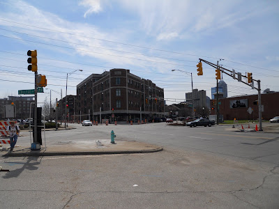
Here are just a few pictures that I took of the site. I took over 200 photos but I decided to condense it down for you guys haha
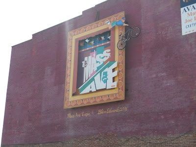
This is what is facing the freeway and is the symbol of Mass Ave.
A small row of shops along Mass Ave. This is the type of shops that I want to put into my design.
Part of the Coca-Cola Plant. Again, this is on Mass Ave.
This is the area in between the buildings looking north.
The whole site has a design like this. Yeah, I can see why we can't/shouldn't mess with the facade.
This is what it looks like in the interior (the corridor). We went down half way before we got kicked out haha.
The 6-way intersection.
Picture of the industrial part. It basically all looks like this: cars, random buildings.
And that's it. Most of the pictures I took is of the surrounding area (neighborhoods) that are located off-site. I felt these are the most important ones for you guys.
And in case you haven't noticed, there's another new post under this one (I think under...) Check it out!
Thanks for reading :)
Sunday, April 18, 2010
Beginning of the End
Hey I actually fulfilled my promise!
Okay, here's my three alternatives for the design of the site. Just like my first post with pictures, this is the process to reach the final drawing.
First, here's the site:
This is what is currently there. The white rectangles to the north west are buses. The northern portion of the site is currently used to house businesses and the transportation offices and such for the Indianapolis Public Schools. We're pretending they're not there. The southern half is a mix of industry and businesses.
First, I already had a ton of different rough alternatives (maybe around 6, 7?) but we only needed three to tada! These were meant to show to my professors for feedback, hence the reason why there's scribble on them.
Just for reference for all of my drawings:
Yellow: Residential
Red: Retail
Pinkish: Business
Green: Grass/Open Space
Grey: Parking
Blue: Special Use (For this purpose a recreational center and outdoor theater)
If you see a building or area with two different colors, it's mixed use, containing both uses usually divided by floors.
Now for my final, clean version of those:
First, I made an underlay for the alternatives on top of the Google Earth image. Without a light table (a glass/see through plastic table with a light underneath that lets you see through paper better), it is hard to see where the buildings and roads were. So, I had to take some time and outline the roads and buildings I knew were there and was considering keeping on my final.
As you can see, I didn't keep a lot of buildings haha. But, there's a good reason for that. The industrial buildings to the south weren't made for public use and I couldn't see an obvious way to incorporate the buildings into a functional design (at least with the time given to me). They're currently large warehouses and huge parking lots. The buildings I did keep have been highly recommended to keep by my professors. They were the site of an old Coca-Cola Bottling Plant so the facade is really cool (I'll post pictures of it in the next post) and the owner of the building can get tax deductions and whatnot. It's not the law to keep the building and the facade but is "highly recommended."
On with the design....
I'm only going to show the process of one of the alternatives since they are basically all the same, just drawn differently. I placed another trace paper on top of the drawing shown previously and outlined the buildings and roads that I absolutely knew the size of. The spaces I was unsure or still deciding I first drew in pencil.
I then inked and showed a rough size of my proposed buildings and spaces. The dotted lines are areas that would be nodes, or hot spots for pedestrians to meet or gather.
I then colored the spaces based on their uses and outlined the buildings and areas (the double line). I still think it's really weird how different it looks by just added a double line...
I then shaded the areas with colored pencil. And voila! the final product.
Here are the final products of all three. Compare it to the previous picture that showed the concept of these.
Oh, and there's my trashcan too.
Just for a fun side-note, here is what my middle finger looked like after I was done. I have no clue how I got so much ink on my hand...and it took multiple washings and about a day for it to go away =P And there's my workspace in my room. I felt like shit earlier that day and didn't want to work in studio so I had to bring everything to my room. I should have a picture of my studio and my desk later in the blog....
And just FYI, my next drawings will be from a computer program, rather than by hand. I make model on the computer of my design, print it, then trace and add color. So, the next posts will not be the same as what I have been posting....you'll see what I mean when I post it haha.
WHO CAN SPOT THE BUZZ LIGHTYEAR IN THE LAST PICTURE!?!
Okay, here's my three alternatives for the design of the site. Just like my first post with pictures, this is the process to reach the final drawing.
First, here's the site:
This is what is currently there. The white rectangles to the north west are buses. The northern portion of the site is currently used to house businesses and the transportation offices and such for the Indianapolis Public Schools. We're pretending they're not there. The southern half is a mix of industry and businesses.
First, I already had a ton of different rough alternatives (maybe around 6, 7?) but we only needed three to tada! These were meant to show to my professors for feedback, hence the reason why there's scribble on them.
Just for reference for all of my drawings:
Yellow: Residential
Red: Retail
Pinkish: Business
Green: Grass/Open Space
Grey: Parking
Blue: Special Use (For this purpose a recreational center and outdoor theater)
If you see a building or area with two different colors, it's mixed use, containing both uses usually divided by floors.
Now for my final, clean version of those:
First, I made an underlay for the alternatives on top of the Google Earth image. Without a light table (a glass/see through plastic table with a light underneath that lets you see through paper better), it is hard to see where the buildings and roads were. So, I had to take some time and outline the roads and buildings I knew were there and was considering keeping on my final.
As you can see, I didn't keep a lot of buildings haha. But, there's a good reason for that. The industrial buildings to the south weren't made for public use and I couldn't see an obvious way to incorporate the buildings into a functional design (at least with the time given to me). They're currently large warehouses and huge parking lots. The buildings I did keep have been highly recommended to keep by my professors. They were the site of an old Coca-Cola Bottling Plant so the facade is really cool (I'll post pictures of it in the next post) and the owner of the building can get tax deductions and whatnot. It's not the law to keep the building and the facade but is "highly recommended."
On with the design....
I'm only going to show the process of one of the alternatives since they are basically all the same, just drawn differently. I placed another trace paper on top of the drawing shown previously and outlined the buildings and roads that I absolutely knew the size of. The spaces I was unsure or still deciding I first drew in pencil.
I then inked and showed a rough size of my proposed buildings and spaces. The dotted lines are areas that would be nodes, or hot spots for pedestrians to meet or gather.
I then colored the spaces based on their uses and outlined the buildings and areas (the double line). I still think it's really weird how different it looks by just added a double line...
I then shaded the areas with colored pencil. And voila! the final product.
Here are the final products of all three. Compare it to the previous picture that showed the concept of these.
Oh, and there's my trashcan too.
Just for a fun side-note, here is what my middle finger looked like after I was done. I have no clue how I got so much ink on my hand...and it took multiple washings and about a day for it to go away =P And there's my workspace in my room. I felt like shit earlier that day and didn't want to work in studio so I had to bring everything to my room. I should have a picture of my studio and my desk later in the blog....
And just FYI, my next drawings will be from a computer program, rather than by hand. I make model on the computer of my design, print it, then trace and add color. So, the next posts will not be the same as what I have been posting....you'll see what I mean when I post it haha.
WHO CAN SPOT THE BUZZ LIGHTYEAR IN THE LAST PICTURE!?!
Thursday, April 15, 2010
Quick Update
Okay guys, I know I haven't updated in over two weeks but there are pretty good reasons
1. Easter weekend, seeing the family and such
2. Our group had another analysis board thing based on the neighborhoods. The group member who put together the board lost her flash drive which contained the only copy of the jpg of the final board so I cannot show it to you guys. Plus, I did demographic stuff on it so there would be no graphics to show from me anyway.
3. I've been working on other homework. I'm trying to finish everything but studio so I can have my full concentration on that. At the moment, I have 2 tests, 1 quiz, and one article to finish. On top of that, I'm in the mid-process of writing 4 papers, all of which I've started writing within the past 10 days or so. I'm getting burnt out with the massive amount of work and it's frustrating when I work on something for hours and have nothing to show for it (no final, finished product).
Blah
But I'm close enough to be able to finish all four papers this weekend, hopefully Saturday. I've just been lazy to actually edit them. Then I just have the quiz and tests which will only consume my life for a day or two.
We're starting our final board and drawings for the studio assignment. I have pictures for my three alternatives (different options for the layout of my final) so I should hopefully be posting those this weekend.
I don't know if I'll be able to update every week until the project is finished. I mean, there's only 2 weeks left on the project...oh God...
If all else fails, I'll post after I turn it in and school is out.
I can't believe I'm done in less than a month =D
Subscribe to:
Posts (Atom)